Search for...
#design Bookmarks
Published Bookmarks
 The Importance Of Graphics In eLearning: Are You Aware?
Though graphics in eLearning add aesthetic value, that’s not the sole purpose of a graphic. Find out why you can’t skip graphics in eLearning in this blog.
 Best practice for translating e-learning content
How can you get accuracy, consistency and reduce costs with your e-learning translations? Find out in this blog post that shares best practices for localising and translating L&D material.
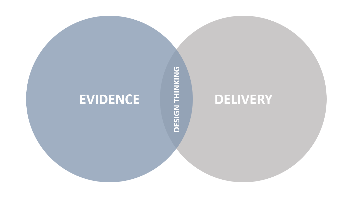
 The best of both worlds
There’s no point landing the perfect plane at the wrong airport. That’s an analogy someone shared with me several years ago to explain Design Thinking, and it has resonated with me ever since.
 Infographics shows the Importance of web design for a professional website
You may ask yourself “why should I update or redesign my company's website?” Let me tell you why? Your present website looks outdated as compared to other websites, their website has a dependable and convincing web design that extremely matters to attract the audience. Website design is a great way to create a user-friendly environment.
 LTD 2018 - An Extended Virtual Conference - eLearning Industry
Learning • Technology • Design™ (LTD) is an extended virtual conference designed specifically for professionals in the business of continuing education and professional development.
 How To Create Beautiful Visuals On Your Own
Video tutorials and expert tips on turning boring information into beautiful visuals. Learn here!
Versioning in design is a real pain – zipBoard
Be it design or development it’s a mess without an efficient version control system.
 A non designer’s design lexis – zipBoard
Being a content team member at zipboard, I’m dealing with designers, developers and marketing professionals all day.And it’s now when I realise, how difficult it can be, to deal with people from divergent work areas. Marketing people are an easy go for me as I’m into the same space and my technical educational background help me keep pace with developers but when it comes to working with designers, it feels like I’m into an altogether different world. Now, to understand the design sphere well a
 Interview with an Instructional designer, Anna Sabramowicz
Instructional designers play a key role in creating e-learning experiences. We at zipBoard are on a journey to understand the ever evolving role of instructional designers. So, after interviewing Keith W. O’Neal and Connie Malamed, we had a discussion with Anna Sabramowicz to know more about the instructional design world.
Here we have combined all her views.
Here we have combined all her views.
Animation Inspiration for your next Website or e-learning course – zipBoard
Animations that can enhance your course or website design and also keep users engaged
Submit Bookmark


