Search for...
#ux Bookmarks
Published ux Bookmarks
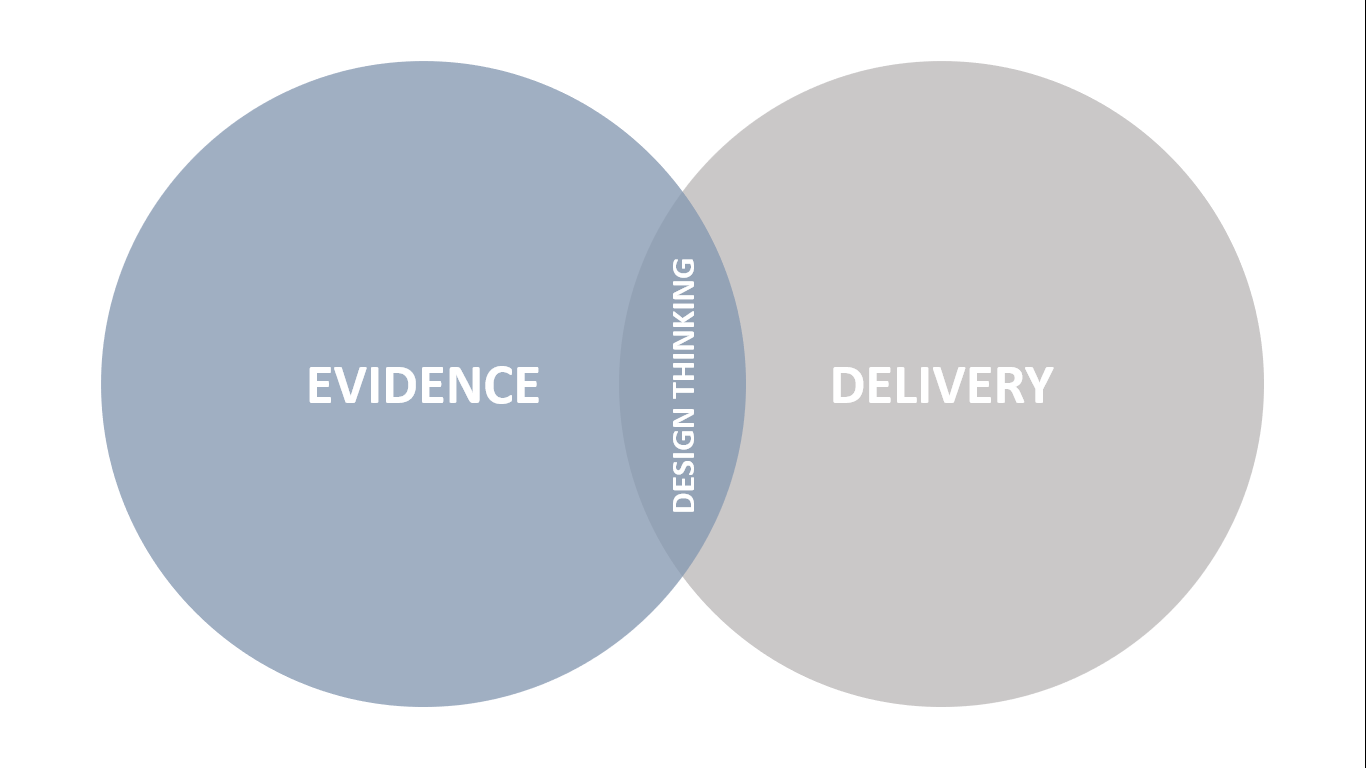
 The best of both worlds
There’s no point landing the perfect plane at the wrong airport. That’s an analogy someone shared with me several years ago to explain Design Thinking, and it has resonated with me ever since.
Still Using Static Progress indicators? – zipBoard
Don’t let users get bored, distract them with some animation, gif…
“As far as the customer is concerned, the interface is the product.”
— Jef Raskin
A good interface is one that keeps the users engaged, at every point and effective, interactive visualisation is the key principle to adhere to,to make it happen the right way.
“As far as the customer is concerned, the interface is the product.”
— Jef Raskin
A good interface is one that keeps the users engaged, at every point and effective, interactive visualisation is the key principle to adhere to,to make it happen the right way.
 6 Simple Tricks To Make Your eLearning Course Stand Out
eLearning is a dramatically expanding industry and way too many eLearning courses are pumping into the market every day. But many of the eLearning courses are poorly made. A good eLearning course is all about providing a good user experience and the right content. Here are 6 easy ways to make your eLearning course stand out and create a rockstar learning experience.
 Moodle 3.2 offers new milestones in usability
Moodle 3.2 was released for download on Monday December 5th. The latest release of the world’s most popular learning management system brings several former plugins into the fold of Moodle core, making them available as default and granting them full support by Moodle HQ. Other changes to the core code have been made to bring new possibilities to the table. Here is a rundown of some key new features, with links to fuller information below.
 The talent behind TalentLMS: A chat with our UI/ UX designer
Sofia Terzidou, working as TalentLMS' UI/ UX designer is out there, answering questions - explaining her way to the career in eLearning, why she thinks it's a fascinating field and how she understands the clou of the industry. Read an interview with her!
 4 Principles to Boost UX Design for eLearning
Improve your trainees' learning experience by implementing our 4 tips for boosting UX design for eLearning, and make your courses pop!
Submit Bookmark


