Search for...
#presentation Bookmarks
Published Bookmarks
 6 Tips for Creating An Effective PowerPoint Presentation | eLearning Brothers
The saying that all PowerPoint developers should keep in mind is, “Just because you can, doesn’t mean you should.” A presentation full of awesome features, animations, colors, and fonts doesn’t always make a good presentation. Here are 6 simple things that will improve your presentation and benefit your audience.
 6 Underutilized PowerPoint Features | eLearning Brothers
Because PowerPoint has been around for such a long time (almost 28 years), they have been able to create features and integrate options that allow presenters and now some eLearning professionals to create content effectively. Let's take a look at 6 underutilized features in PowerPoint.
 New Cutout People For Your PowerPoint Presentations | eLearning Brothers
If you have been following along with our blog, you will have noticed that we have been updating our Cutout People Library each month. And for all those who haven’t been following along, we have added over 12,800 cutout people this year alone!
 Preparing A PowerPoint Animation Strategy | eLearning Brothers
PowerPoint is always releasing new content that will draw people to their product and make life easier for developers and presenters. But a common problem PowerPoint users encounter is, “Which of all these amazing animations should I use?” Well, that fully depends on what kind of presentation you are creating/presenting and who you are presenting to.
 Engage Your Audience With These New Cutout People - eLearning Brothers
With the online training world growing at a rapid pace, presenters and instructional designers are look effective ways to create connections between them—or the content—and their learners. The solution? Cutout People.
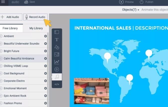 Visme: How to Use Presentations With Voice Overs in the Classroom
How to Use Narrated Presentations With Voice Overs in the Classroom Mastering Presentations. Ideas for Using Narrated Presentations.
 Create the best visual content with Visme
Create the best content: presentations, infographics, and much more. It’s free and super easy. Visual Learning Center: The resource to help you become a better Presenter, Communicator and Sto…
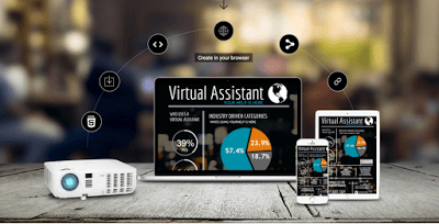 Visme: Great Tool for Creating Engaging Infographics and Presentations
The popular Visme has recently introduced a number of interesting features that make it even much more easier to create professionally looking infographics and presentations without the need for any design knowledge.
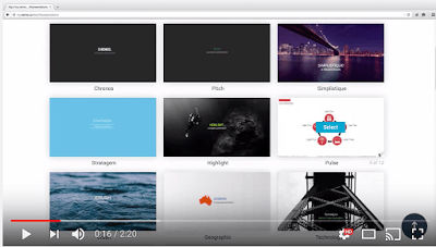 Visme: Great Tool for Creating Engaging Infographics and Presentations
The popular Visme has recently introduced a number of interesting features that make it even much more easier to create professionally look
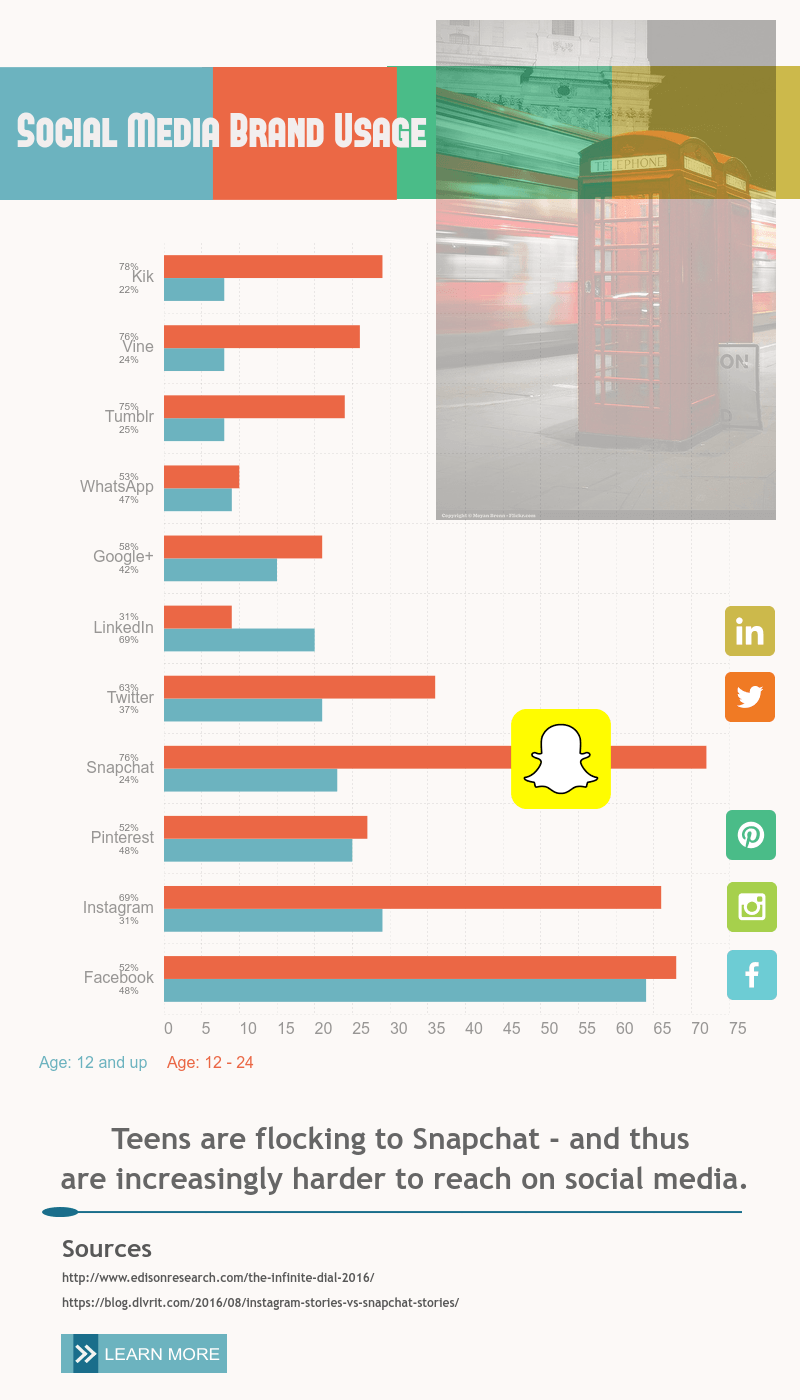 How to Explain your Data Better with a Free Infographic Maker
Infographic maker, Visme, allows you to create amazing presentations, infographics and other engaging content. Read about our experience using Visme.
Submit Bookmark

